What is Bad Design in Graphic Design?
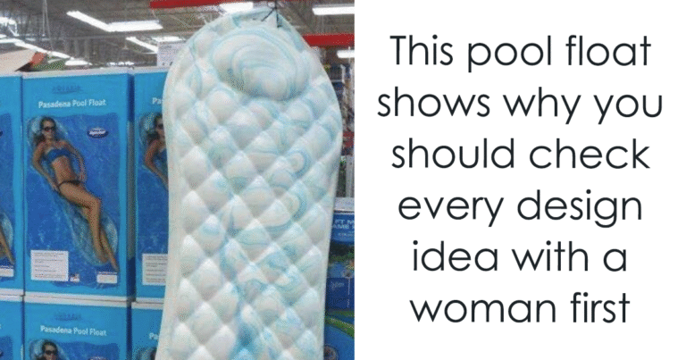
Ah, bad design—like a bad haircut, it’s immediately evident and can leave a lasting impression, usually one you want to forget. Bad design occurs when its primary mission—effective communication—decides to take a permanent vacation.
Imagine a website bursting with elements like it’s trying to win a clutter contest: a kaleidoscope of colors, a font family reunion, images competing for your attention, and text packed tighter than a subway during rush hour. Welcome to the circus where focus goes to die. Good design, on the other hand, is like a breath of fresh air—each element has its own space, like well-behaved guests at a fancy dinner party.
Speaking of dinner parties, let’s talk about inconsistency. Mixing design styles, fonts, and colors at random is the equivalent of wearing polka dots, stripes, and plaid—all at once. Congratulations, you’re now a human funhouse mirror! Good design is more like that sophisticated friend who always sticks to a theme: classy, cohesive, and definitely not someone you’d avoid at parties.
Now, let’s touch on typography, shall we? Bad typography is like a waiter who serves you a delicious meal but forgets to mention which course is which. Ever tried deciphering a menu that reads like a code? That’s what happens when typography gets lazy. Good typography knows when to whisper sweet nothings and when to shout “THIS IS IMPORTANT!” It makes the journey through the content enjoyable—kind of like an amusement park ride, minus the nausea.
And here’s a plot twist: bad design doesn’t care one bit about cultural perceptions. It’s like throwing a surprise party in an unfamiliar language—with a piñata full of misunderstandings. A great designer takes the time to understand their audience and mindfully crafts designs that fit cultural contexts, ensuring that no one leaves feeling confused or, worse, offended.
Now let’s talk about usability. Bad design is like a friendly dog that tries to retrieve your coffee cup but takes a chunk of the table with it. If users can’t navigate your design without a map and compass, what’s the point? Good design gracefully guides users, helping them find their desired content without needing to consult the Oracle (or a design specialist).
In summary, recognizing bad design can be easier than spotting a fake designer handbag. It fails to communicate effectively, brings chaos instead of clarity, and ignores the nuances of cultural relevance. So, if you want your design to be remembered for all the right reasons (preferably not the “what-were-they-thinking” kind), it’s time to invest in good design practices. Because nothing says “I care” like a well-designed piece that actually works!

