According to marketing gurus (you know, the ones with glasses and fancy degrees), a stellar logo is like gold dust for any company. It’s not just a pretty picture; it’s that delightful beacon guiding customers straight to your brand. Just think about the logos that haunt your dreams—they’re like the relentless ghosts of marketing past. Their corporate soul is intertwined with their products, making it feel like a bizarre yet harmonious dance. For companies hunting for that perfect logo, it’s crucial to grasp the secret sauce for effective design. Otherwise, you might end up with something your grandma wouldn’t even hang on her fridge.
Spotting a Good Logo vs. a Disaster
First off, a great logo should slap you across the face in a delightful way the moment you see it. Your logo’s visuals need to be eye-catching—not because they resemble an abstract art project gone wrong. But hold on! Just because it’s shockingly bright or confusing doesn’t guarantee it’s a winner.
Sure, creativity is essential, but remember: complicated logos have a knack for flopping faster than a three-legged race at a family reunion. Simple does not mean dull; some logos are so elaborate they come with a user manual. Conversely, if your logo looks like it was scribbled by a toddler, it may also land you on the “Logo Hall of Shame.”
Check this out—here’s a delightful compilation featuring design disasters that’ll make you simultaneously laugh and cringe. Let’s dive into the dark world of bad logos!
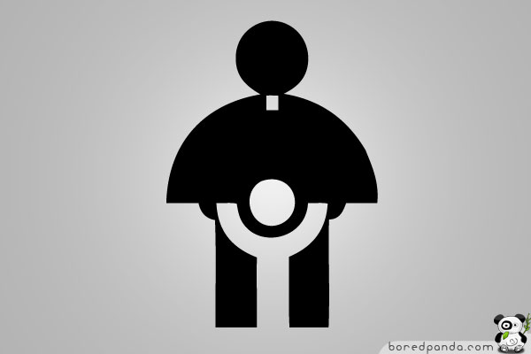
Behold: The Catastrophic Catholic Church Logo
Designed in 1973 for the Catholic Church’s Archdiocesan Youth Commission, this logo is such a stellar disaster it actually won an award. A moment of silence for its artistic integrity, please.
A-Style’s Oddball Logo
This gem was conceptualized in 1989 and was supposed to launch a clothing line in Italy. However, it became infamous for sticker campaigns that would make even the most shameless guerilla marketing guru blush. A lesson learned: sometimes, ‘stick it to the man’ can lead to pacifist sticker shock.
Office of Government Commerce: A Lesson in Confusion
The Office of Government Commerce had one job: to make government less confusing. Clearly, they missed the memo as this logo leaves more questions than answers. Is that an acronym, or did someone spill Scrabble tiles?
A Crash Course on Avoiding Logo Disasters
Hidden imagery in logos? Funky, until it’s inappropriate. Bad news: sometimes those “hidden” features are as subtle as a brick through a window. So, how can you craft a logo that doesn’t send potential customers running? Here are some golden rules.
Ask yourself: does the logo convey your company’s essence? Is it avoidably memorable (think catchy, not cringey)? And will it still look good upside down? Because if not, it’s back to square one.
The Quirky Mont-Sat Logo
Mr. Satellite here looks positively joyous, but you have to wonder, is he really a mascot or a confused antenna that wandered off during a power outage?
Clinica Dental: Or Is It a Horror Movie?
The human figures here might just be auditioning for a horror film, leaving patients wondering whether they’re there for a cleaning or an exorcism.
Final Thoughts Before You Click “Send”
In a nutshell, creating a logo that doesn’t belong in the “What Were They Thinking?” collection requires a blend of wit, wisdom, and occasional restraint. If your logo can’t immediately tell customers who you are, well, that’s a cue for a redesign. Meanwhile, let’s spare a thought for those whose logos went down in style—like a sinking ship with an entertaining anthem. Proceed with caution, dear designers!


